


Design Anything, Build Everything
Design and launch your website fast & no coding knowledge is required.
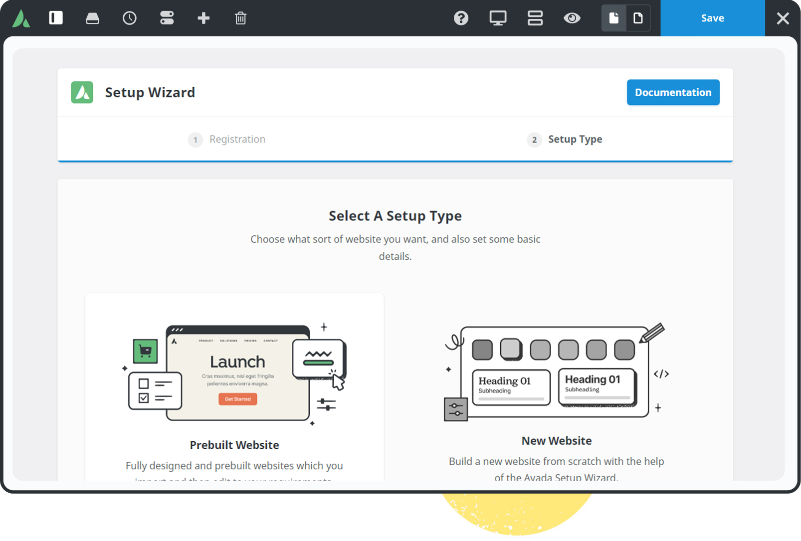
All-In-One Website Builder
Experience total control over your website creation process.

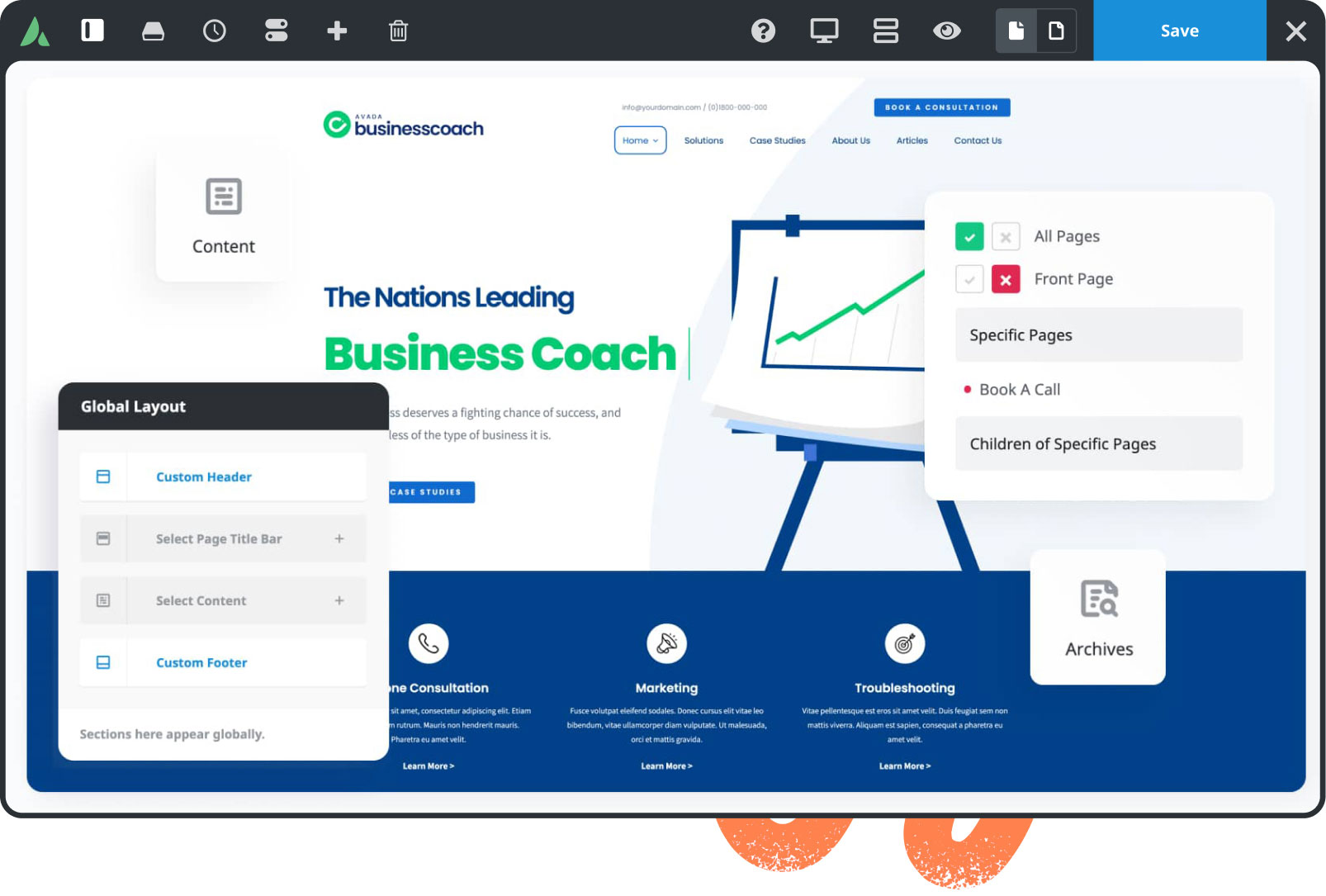
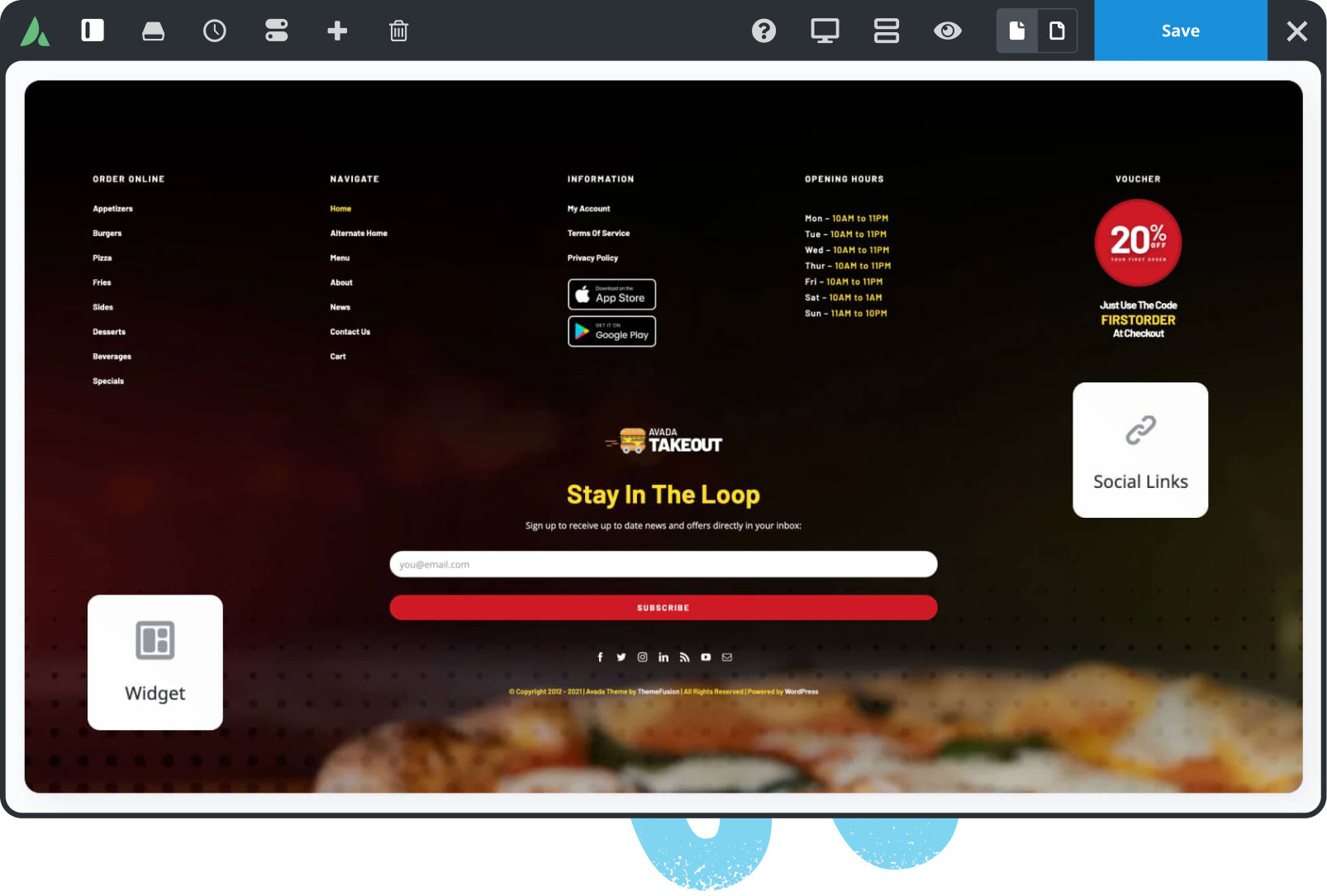
104 Prebuilt Websites
Prebuilt websites are designed to save you time. Import with a few clicks & customize it to suit your requirements.

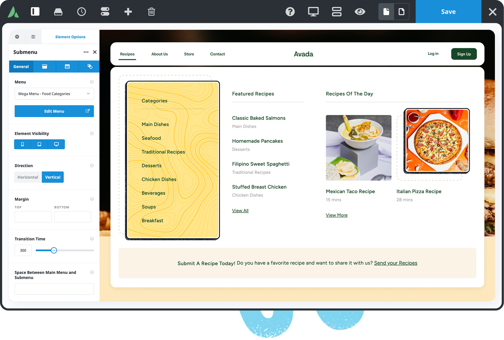
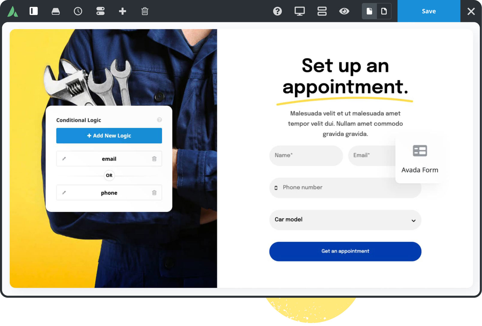
120+ design elements
Packed with options, they are highly flexible for any design & for any purpose. The only limit is your imagination.

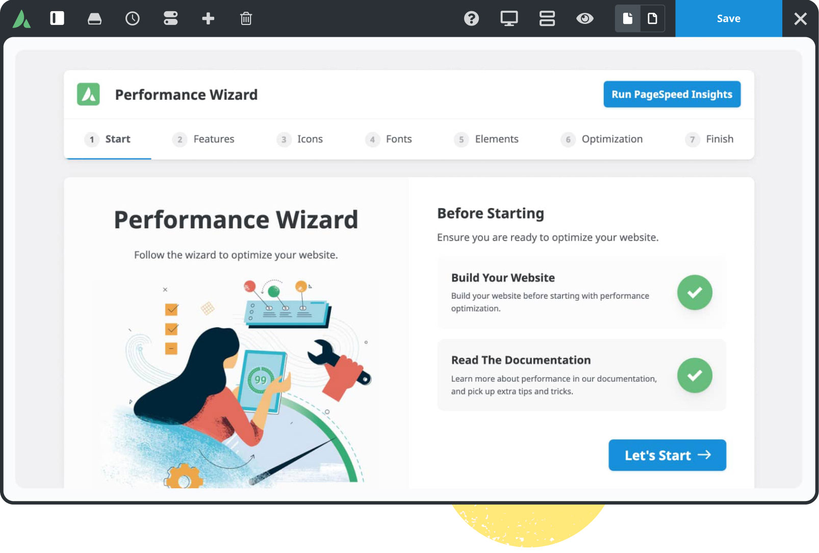
Built For Performance
Experience total control of your website’s features that will empower you to make superior performance-related decisions.

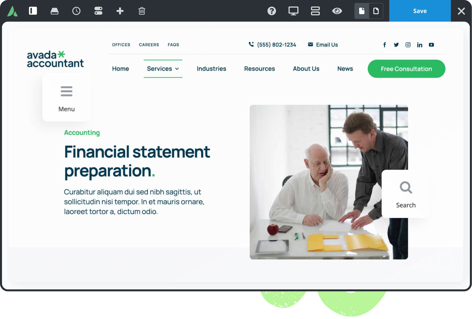
Mobile Friendly
Avada is 100% fluid & responsive across all device types, from mobile to desktop & tablets, with no compromise.

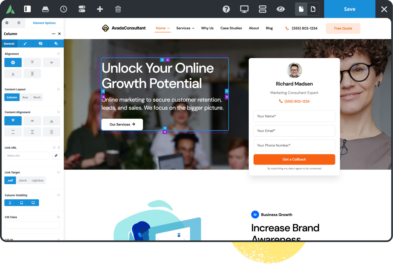
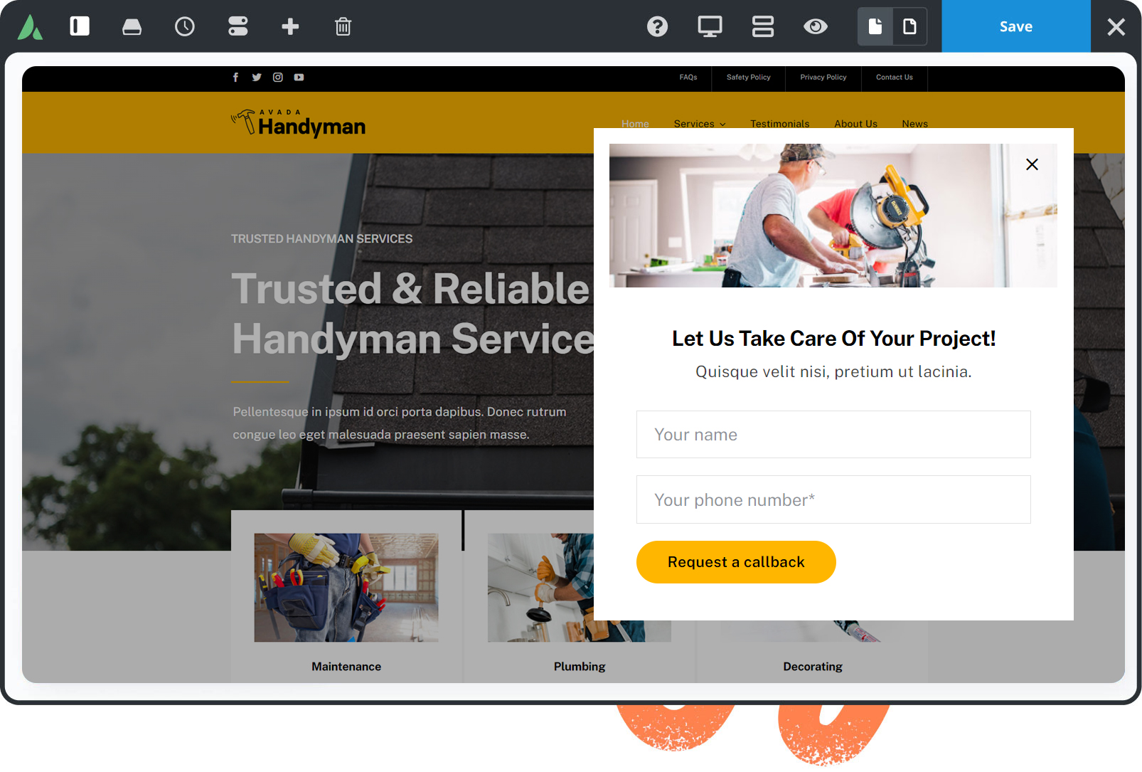
Dynamic content
Build unique pages & post layouts for your website by harnessing the power of Avada’s dynamic content functionality.

Online Store Builder
Avada is integrated with WooCommerce, allowing you to build successful online stores to sell anything online.
959,517 Website Owners
Trust Avada
The #1 selling Website Builder on Themeforest for 11+ years.

World-Class Support
We build long-term professional relationships with our customers that you can rely on & trust.

Documentation & Tutorials
Over 550 help files & 200 tutorial videos will make building websites with Avada even easier.

100% Built In-House
Avada is not reliant on 3rd party tools to deliver a reliable & stable website building experience.

Free Lifetime Updates
Your website will receive free & regular updates, compatible with industry standards & trends, for life.

 Squarebird


